Designing a simple user interface can oftentimes be more difficult than expected. They are deceptive. A frictionless interface is no stroke of luck; a lot of work and experience go into making something you can use without thinking about it.
In a way, it has some similarities to abstract art; you may look at a painting and say “That’s so easy, I could’ve done that!” But in reality, the artist needed an understanding of the history behind how traditionally similar work was done, how to control the materials and medium, and how to realize the idea to subvert expectations and/or successfully get the response they were looking for.
The same is true with designing intelligent interfaces. To make something that seems simple, the designer needs to understand how similar things are expected to be done, how to shape and control the interface to create a new yet familiar look and feel, and how to realize the idea and deliver a final product which will get the response they were looking for.
Everything has been done before, but maybe not in that way
Everything has already been done. If you have to invent some new kind of interface, then you may be making things too complicated. The design process should be simple. Think of your interface as a series of Lego blocks, where on their own they don’t do much, but together make something whole. Each block can be a component, and how they are arranged is what builds your user interface.
A good design is an intelligent arrangement of familiar controls and systems in a way that is invisible to the user. A good interface is one where the user doesn’t need to think about how to use it; it simply works how they expect.
The Design of Everyday Things
There is a great book by Don Norman called “The Design of Everyday Things.” It gives great examples of why it shouldn’t take seemingly smart people to understand how to operate light switches, doors, and VCRs (yes, it’s an older book). It should be easy. And that there is a language designing things to make them intuitive, giving familiar evidence to users on how to use something, without false evidence that gives incorrect assumptions.
A prominent example which you may do often, but never even think about, has to do with the way public doors are designed. They have either vertical or horizontal bars to visually assist in helping a user determine if the door is a push or pull. You may have at some point also tried to push or pull a door the incorrect way because of “false evidence” the design gave you.

Another great example is the teapot. A teapot has a handle on one side and a spout on the other. This interface works together naturally. Picking up the teapot and pouring it can happen intuitively when holding onto the handle. You wouldn’t want to put the handle on the same side as the spout, it wouldn’t make any sense, you couldn’t tilt it properly and you would end up burning yourself when you pour hot tea onto your hand.
Our user interfaces should behave similarly. It should be difficult to use the wrong way, and intuitive to use the right way.
Applying this to digital interfaces
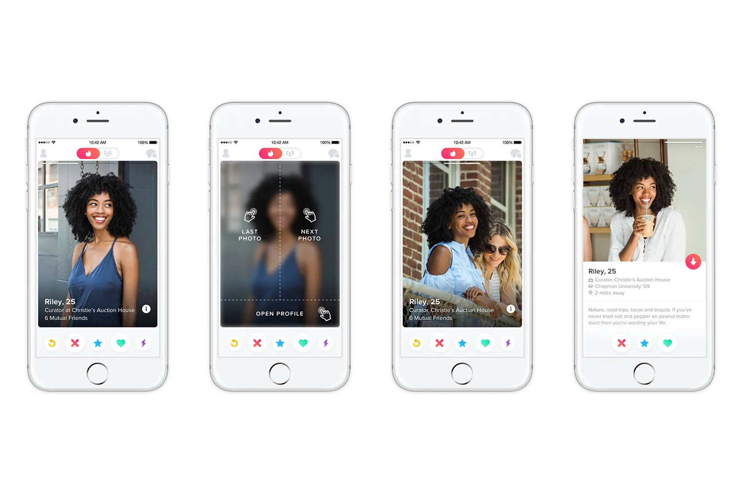
Applications should be tailored to the expected experience of the user, no matter what device, platform, or system they are using. Interfaces designed for both mobile and desktop can all use natural intuitive controls via tapping and dragging the screen, two-finger scrolling, or using a mouse wheel to load and display more content. Additional content is hidden by default if it grows outside the viewport, but the user can perform a natural action to display it, should they so choose.
The key takeaway here is that vertical scrolling is the natural flow. This is a bit of a carryover because of the way desktops handle scrolling. All different scrolling methods can handle verticality easily, but some do not handle horizontal that well. But, if we had an application that was only designed for mobile, the thumb could naturally swipe left and right just as easily as up and down. We could therefore design a system that has a natural feel but moves content horizontally instead.

Going one step further than this, if we have a navbar fixed to the bottom of the screen, it’s not unexpected that it could get in the way of our vertical scrolling behaviour on small touchscreen displays. That’s why mobile navbars are more often at the top of the screen (well, that and because if it’s not accessed as frequently it can be further from your thumb). If, however, we used horizontal scrolling, then we no longer have that limitation, and a navbar on the bottom of the screen isn’t that crazy of an idea. It may even be more usable depending on how often it needs to be operated.
Ok, Grandpa, but mobile apps have been “figured out.” How does this apply to anything anymore?
It always applies to everything.
Let’s travel to the future for a moment. Let’s say we no longer build responsive applications based on visual screen sizes alone, but also for auditory-only users. Today, this is only really thought of as providing standard accessibility controls, but that’s just a tool used to decipher visual content for someone who may be visually impaired. It is not as intuitive as having a custom auditory interface where you can interact with the system with spoken commands. Like a combination between an AI and “Moviefone.”
Or, maybe, the content needs to be accessed on visually limited devices, like dumbphones, smart glasses, smartwatches, and so on.
It’s always a good idea to consider the medium, who the user is, how they are going to interact with your interface, and any friction that they may have. That way we can be sure we are designing it intuitively to use the correct way.
Keep it simple
Most developers spend too much time over-engineering things, adding every request the user asks for, and not enough time understanding their users and why they want those features. If the developer doesn’t take a step back once in a while to have a look at what they are creating, the result inevitably becomes “The car built for Homer.”

Interfaces should be simple. Less is more. Focus on what is important and deliver that message without all the baggage.
Keep it Familiar
Keep things familiar to your users. Use existing patterns to help guide them to use your interface the correct way.
If you work primarily in a browser, this means taking advantage of all the natural browser APIs and accessibility controls so the user can digest your interface without friction. If they have a larger default text size, that’s great, make sure the interface is responsive and can support it. If they use a dyslexic font, that’s great, support it too. Text to speech. Tabbing between links and inputs in a logical order. Page up and down buttons. Scrolling. Tapping. Clicking. Highlighting text. It should all be supported and natural.
If you’re working in native applications for mobile or desktop the same rules apply. Make sure your user can use the native operating system controls for copying and pasting, minimizing and maximizing, have sane default controls like CMD-S to save on Mac and CTRL-S to save on PC/Linux, and just try to make it feel intuitive.
In Conclusion
I hope this provided some insight regarding what work goes into designing and developing frictionless user interfaces. Here are some of the key takeaways:
- Know your audience and how they intend to use your product.
- Build an interface that supports their current understanding by giving them familiar ways to interact with it.
- Try to avoid giving users “false evidence” that can lead them off-course.
- Keep things simple, familiar, and consistent.
- Less is more. Focus on what matters and make it exceptional.
